The Tradition
African craft tradition has always understood something that modern digital design has worked hard to engineer away: the hand that made a thing is part of the thing.
A woven kente cloth carries the tension of the weaver's hand in every thread. A carved Yoruba door carries the weight and direction of the artist's chisel in every line. A Ndebele pattern carries the painter's breath in the slight irregularity between each geometric form. These marks are not imperfections. They are presence. They are what separates a living object from a reproduced one.
Perfect Imperfection is AfroMax's commitment to carrying this tradition into a mobile interface. Every border, every icon, every illustrated element on AfroMax is designed to feel like something made by a human hand — not generated by an algorithm, not optimised for visual cleanliness, not sanitised into cultural neutrality.
The result is a platform that feels warm, specific, and alive. That quality is not accidental. It is designed in.
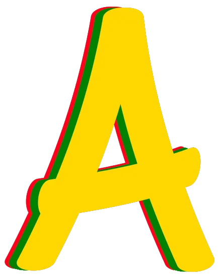
The First Characteristic — The Handmade Mark
AfroMax's borders carry a quality the design team calls the handmade mark. Rather than a mathematically perfect line rendered by a rendering engine, AfroMax's component borders trace a path with controlled organic variation — the kind of variation that only exists when a hand is holding the tool. The corners are kept tight, a deliberate signal of seriousness. The organic quality lives in the stroke itself.
The same principle extends to every illustrated element on the platform. AfroMax illustrations are bold and flat, drawn with strong forms and organic line weight in the tradition of West and East African visual art. They carry cultural specificity — the African hut, the coral bead, the drum — rather than the generic iconography shared across every other app on a member's phone.
The icons are custom. The illustrations are specific. The borders are hand-drawn. Taken together, they produce a platform that could only be AfroMax.
The Second Characteristic — Hierarchical Scaling
Traditional African sculpture communicates meaning through scale, not anatomy.
A Yoruba fertility figure is not proportioned to the human body. It is proportioned to what matters — the forms that carry meaning are enlarged, the rest recedes. A royal court carving places the king at a scale that exceeds every figure around him not because he is taller, but because he is more important. The Pharaoh is larger than his subjects not because of perspective, but because of significance.
This principle — the most important element is the largest — is the second characteristic of Perfect Imperfection.
Applied to AfroMax's interface, hierarchical scaling means that the element carrying the most cultural or functional weight on any screen carries the most visual weight. The screen title does not label — it declares. The word Gold at 24 points in ConcertOne bold fills the app bar with the weight of what it represents. The word Love does the same. Events. Sounds. Each word is given the scale its meaning deserves.
This is scale as meaning. Not scale as proportion.
What It Produces
A member opening AfroMax for the first time encounters a platform that feels different before they understand why.
The borders feel carved. The icons feel specific. The screen titles feel like they mean something. The illustrations feel like they come from a world they recognise.
That feeling is Perfect Imperfection doing its work. It is not decoration. It is not aesthetic preference. It is the consequence of building a platform from inside the culture it was built for — where the design decisions are drawn from the same tradition as the kente cloth, the carved door, and the royal court sculpture.
The culture is the design system. Perfect Imperfection is how that becomes visible.